Can we agree that there is at least 1 thing that is 100% right and 100% wrong for the armed forces of a Representative Republic; the armed forces should never adopt in whole or in an obviously derivative manner any symbol of a domestic political party, organization, or movement?
Can we at least find common ground there?
Maybe I do need an AFDB.

Standard issue for a US military heraldry perspective.
Now for the new logo.

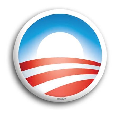
Bounce that off of the Obama for President logo:
 In another binary moment: the person who approved this is either colossally ignorant and inept, or they are trying to curry favor with a political movement via a ".mil" domain.
In either case, that individual needs to immediately and publicly explain himself, resign, and/or be fired.
Full stop
I know that seems harsh, even for me - but I do not care if you have the Obama for President logo tattooed on the tip of your John Thomas; you have to agree that the US military should not be even close to this. This habit has a very bad history and of all nations, ours should be the last where a military adjusts its heraldic items to reflect something involving political parties.
Please, tell me I am wrong here.
Hat tip ClosingVelocity.


82 comments:
I was coming here to say the same thing as Byron.
Maybe it's something far more subversive. Years from now when that patch is a historic relic of a program Obama gutted, someone will pick up the patch and examine the red scarf embracing the crescent moon and the emptiness inside it and compare it to the Obama logo and see it as a symbol of who gutted our strategic defense.
Otherwise it's just some arse-kissing short-sighted libtard that has fallen in love with Teh Obama's hopey changey bullshite. Maybe you're right.
It greatly reminds of a certain proposed memorial in a Pennsylvania field...
The resemblance is eerie, but I wouldn't be too concerned. McCain wasn't an Admiral, but he used the image of a military rank star in his campaign. I'm surprised to see military concern over the imagery, but not the controversial realities.
Philo,
You gotta be kidding. You don't really see the difference between a campaign logo that borrows from a military service symbol and a military service symbol that looks like a campaign logo?
Philo,
The problem is that the military swears an oath to the Constitution, and NOT any party or person. This is a VERY dangerous precedent, and to allow it to go unchallenged is the height of folly.
It's bad enough that we have GOFO's trying to curry political favor for post-service positions, or jobs in the defense industry while still serving on active duty.
This, though, crosses the line. Once the military crosses the Rubicon into politics, of any sort, then all bets are off and no US government can ever again feel safe.
C'mon, Sal! "<span>This habit has a </span><span>very bad history</span><span>"? </span>
Thomas Friedman reminded us not long ago that repressive autocracies come in handy for passing health care and climate change legislation! So what's the big deal?
Philo, one star is the cuff mark of a line officer in the USN, just as the pork chop is the Supply Officer. As for the new logo, HOLY LUFTWAFFE TAIL EMBLEM, BATMAN!
<span>"In either case, that individual needs to immediately and publicly explain himself, resign, and/or be fired.
Full stop
I know that seems harsh, even for me"</span>
<span>~~~~~</span>
<span>That's not harsh.</span>
Agree 100%, particularly from a military heraldry perspective, as the new emblem is waaaaay out in left field compared to the standard.
That said, I think that Hanlon's Razor applies here and this is not, in fact, cause for alarm that Obama and his secret Muslim cohorts are planning on selling all our secrets to the Chinese. Someone just got a little overzealous and needs to be reigned in...after a very public flogging.
But hey, I don't know much and apparently never will, so to use what you folks call logic, you all should probably reconsider your position since I'm agreeing with you now and I'm just a dumbass butterbar.
Maggie's right. Harsh would be making them sit in the right field bleachers in Fenway during a pennant race with a Yankees jersey on. During a Yankees series. On bat day.
See? Was that so hard to admit?
Or just standing outside Fenway any day of the week with a Yankees Jersey on. Or a JETS jersey, for that matter.
=-O
Jet's jersey! ROFLMAO! Yeah! Good one Tim! :*
Seppuko is out of the question?
If you want it to have a political conitation, it will have one. But, in all honesty I think you're taking John Boyd's "Destruction and Creation" a little to far.
I mean, will anything that is blue, with a red parabola now be considered a homage to the Obama campaign logo?
Non-sequitur: Phib, you have been making liberal use of "Full stop" - 3 times in Feb already! Not sure if it is indicative of the more serious than usual stories or just a well worn neural pathway...
I dunno.
I agree 100% with: "<span>the armed forces should never adopt in whole or in an obviously derivative manner any symbol of a domestic political party, organization, or movement"</span>
Having said that, I think the sensitivity knob on this one is cranked up a little too high. I'm finding it a bit of a stretch for me to see this new logo as paying too much homage to the Obamabot "Rising Sun". Then again, I'm not trusted with picking out paint colors at home.
Truth be told, the new logo is flat-out ugly and doesn't represent the mission nearly as well as the previous version. I find it hard to believe they actually got it past the Heraldry folks. Two questions come to mind:
1. What was so wrong with the previous version that it had to be scrapped?
2. How much was paid (to a consultant, presumably) for the development of the new logo?
Anyone seen that Simpsons episode where Homer finds the box of Mr. Sparkle? Alright, I'll stop now.
So you think this might be as innocuous as "fishbulb"?
Well - it does look like something out of a 1950's space cadet series. I frankly didn't catch the Obama-ism (but you're dealing with a guy who has no colored socks.) Can we compromise, drop the new logo and assign the artist to more suitable duties? The paint is peeling on USS Iowa, I understand.
while it mimics Obama's logo, it struck me more as incorporating the Islamic star and crescent
http://rlv.zcache.com/silver_colored_star_and_crescent_symbol_sticker-p217782562727483699qjcl_400.jpg
Seppaku would be getting off easy.
Not to mention being a Zoomie on a Squid site.
This one is far better:
The new logo seems to of a piece with the current AF logo. The old winged star was far more recognizable, but the current AF GOs wanted something more new age than the old one that had so much history and tradition behind it. It also looks quite "Jakey," as they said it in Ohio.
Pepsi does, and is banking on it. Literally. Pepsi decided to yank it's NFL spomsorships in favour of promoting a new "public servicce corps", and even updated their own logo to look more closer to Obama's.
A patch isn't a service symbol. I think there is a lot of cross over between imagery. I think using military imagery for political gain is far more dangerous than a military organization designing an emblem that bears resemblance to a campaign logo. One is playing up an aspect of his background that is far from relevant, the other is being inspired by the sitting President. Obama is the CINC, it wouldn't surprise me to see all the services looking to curry favor from the CINC. Imitation is the most sincere form of flattery. We all know who McCain was trying to flatter, and we know who MDA is trying to flatter, you decide which is more dangerous. Personally, I find military endorsement of a candidate more dangerous than military endorsement of a President.
I thought pork was the mark of a US Senator?
MInd bogglingly partisan.
YNSN. Look at the number and structure of the red stripes. Look at the color saturation and hue of the blue.
I come from a long line of artists with a liberal arts education - it is very clear where the inspiration came from.
I have spent too much time with Canadians .... and like old school TTY talk.
Yep, it is an irritating stylistic tell .... but of greater concern. .... why are you tracking my usage in that detail? Spooky.
Well - *that* came out of left field. Wonder if it's just a website deal since I know that as late as this past Friday, official briefs were still using the "legacy" logo. Still - it does have a cetain anti-islamist look to it, a red ray spearing the crescent dead center. YMMV...
w/r, SJS
We all sit at the Salamander's tail and soak in the greatness....
Seriously, my blog admirer sent flowers and chocolates today....tell Ex-FleetLT to cough up some tribute.
CDR, I'm just one of those damned troublemaking engineers but it occurs to me that if you have to apply that level of analysis, something missed the mark.
Y'all are worried about the linkage to Obama. I think I'd be more worried about the (to me, anyway) obvious derivation from a corporate logo:
That crazy liberal arts education the Navy paid for makes me read for style, not just content. You have pretty good style (inclusive of old school terminology), which is why I bothered to bring it up...so I hope you take it as a sign of respect.
The track you're on of breaking real stories like stolen-valor, USNA color guard, etc will bring your writing under much greater scrutiny than little ol' me.
Heh, set myself up for that one.
I've been lurking/semi-occasionally commenting here since before it was cool (even got linked a few times!), so I guess I'm just a glutton for punishment.
I've taken to using "full stop" myself, thanks pretty much singlehandedly to the CDR. Does such a good job of conveying what it's meant to convey.
In defense of the current AF GOs, the change was made some years ago, our leadership is worrying about bigger things now...like figuring out how they're going to B.S. their way out of the mess they (and Gates) have created with the JSF.
I do. There is a difference between corrolation and coincidence. With this, I shall err on the side of coincidence. I do believe it to be complete innocuous.
Sir,
Yes, I can conceed that there are stylistic similiarities. But, inspiration? To create a eye catching logo (albiet an weak one) sure. But, I almost feel like we are looking for symbolism on par with the likes of the "Da Vinci Code".
I think it is too much of an extrodinary assumption to think that someone at the MDA is looking to garnish favour through something as banal as their logo.
If anything Grumpy Old Ham is way more on the mark with his statement that it has more in common with Boeing than it does with Obama. Or, are we now to see this conspiracy go deeper to both gain favor with Boeing and Obama?
This just really seems like, almost like paranoia, to me. I'm sorry to say it. But, it just does.
But, regardless, let's get down to brass tax. Let's say that, yes. The MDA designed this logo because of their admiration for the Obama logo. We can go ever further and say they did this directly to garnish favor with the Obama Administration. So, then, what is next? What will the end result be? Will the GOFO in command of the MDA now find himself as our next CJCS, or Serivce Chief for his branch? Maybe his retirement is secured by a political appointment by the Obama Adminisration... Ambassador to Tahiti? Is this a warning to all Republicans that work there that their brand of politics is not welcome at MDA?
I mean even assuming the worst case on the part of the MDA it is hard to see how any real benefit will come to them. I just to do not see this adding up to anything of importance.
Any activity in DOD that has time and resources to waste on changing logos obviously has too much time and resources on their hands.
Fork it over to a program that actually does something useful!
I can see either the Obama similarity or the crescent and star. Both suck. They really need to stick to the old logo and get back to work.
John hit on an aspect that is equally important. Government waste. Even if this wasn't an attempt to suck up to Obama, it still was an act of needless waste. How much was spent on this crap. I'm sure some will think that in the grand scheme of our massive deficit it is relatively chump change. I hear the same BS when complaining about earmarks or pork. BS. Waste is waste. Our deficit would be non-existent if our government overlords only spent confiscated tax monies on things Constitutionally mandated.
That's a surprise to me as a foreigner. Our military has never been prone to follow anything that could be regarded as "progressive" in any respect...well, apart from Blitzkrieg, I must admit.
If memory serves, didn't some of the theory regarding blitzkrieg come from the on-site staff studies of our Civil War?
There are so many transplant Lawn Gusylanders in Boston that a NY Hat at Fenway isn't unusual nor disturbing. Harsh would be having the Yankee fan go into any local dive bar frequented by locals. Harsh is simply being a JETS fan, doesn't matter where you go or what you wear ;)
Words fail me.
A blunder of brobdignanian proportions.
The new logo reminded me of the three-stripes-through-a-ring emblem that has appeared on many NASA patches over the years (such as STS-53: http://history.nasa.gov/patches/shuttle/STS-53.jpg ), not of the Obama-Biden logo.
Byron, it was an evolution of tactics the Germans tried in WW1. The Germans in WW1 simply did not have the mobility to implement their strategic vision. It required somthing that simply did not exist at the time. The British invented the "land ship" but automotive technology was not sufficiently advanced. The combination of Guderian's vision, with advances in automotive technology yielded blitzkrieg.
Jackson's campaigns were studied by the German General Staff during the interegnum between the Franco-Prussian war and the turn of the century, but the results were indifferent. I have yet to meet, or read, anyone that really understands what went on in Jackson's head. I myself don't. Jackson certainly engaged in strategic and tactical misdirection. He once said, " if I fool my friends, then I can certainly fool my friends," or soemthing to that effect. That was simply an application of Tzu.
Jackson was also famous for his "foot cavalry", with which he was able to routinely flank the (my Southern roots will show here) Bluebellies at every turn. It was this, and the Souths ability to move troops quickly that the idea of the Blitzkrieg came from. At least, that's what I read once...
YMBFKM. Lame response. Please try again.
Well, this was adapted by Sherman later in the war, and the basic idea for blitzkrieg is the same since the days of Alexander's agema - punch thru enemy lines with elite, mobile troops and wreak havoc from the eney rear. XX century incarnation was made possible by tanks and trucks, but Germans made crucial contributions in radio C&C and air support as well as coordination for combined arms. BTW, many times victims of blitzkrieg became it's great exponents, I've mentioned Sherman in the Civil War, and by 1944 Russians were able to visit upon Germans Bagration in a mirror image of Barbarossa... Hitler even managed to mirror Stalin's "no retreat" orders of 1941...
And German military made once a shame of adopting Nazi salute instead of traditional... Maybe not a progressive (although many conservatives will argue that Hitler was leftist at heart), but certainly political party symbol.
Why not contact them and ask?
MDA Media Contacts:
Debra Christman (asst. PA)
• 719-325-8289
• debra.christman@mda.mil
Rick Lehner (Agency PA)
• 703-697-8997
• richard.lehner@mda.mil
<span>My response was honest. I mean no disrespect - certainly, this is your blog, and your rules apply here - but I don't appreciate it being dismissed. As I said, it was my honest reaction.
My name, as you might imagine, has predisposed me to an interest in NASA. That interest has led me to see quite a bit of various NASA emblems over the years, many of which contain the three-stripes-through-a-ring emblem NASA uses as the symbol of the Astronaut Corps (the stripes - symbolic contrails - symbolize the Mercury, Gemini, and Apollo cohorts). (My meager blog indicates the direction of my interests: http://guardianorion.blogspot.com/ .) It should probably be no surprise, then, that the new Missle Defense Agency logo reminded me of the Astronaut Corps emblem. They are somewhat similar in their construction, with three contrails converging on a burst of light.
I don't know whether the internet or the political atmosphere has caused us more to suspect honest reactions, and distrust honest statements. I've read many of the white-wash releases and statements you highlight on your blog, and I know that we are routinely belabored by lies. But I would appreciate being taken at my word, at least as a fellow American, if not as just a fellow person.
</span>
Oh, please. My saccarin level just peaked.
Orion,
With a name like that - I thought you might be a P-3 guy. Don't take it personally, as a regular reader, you know we play a little rough now and then, but it is all in a fun bloggy way.
Lighten up Francis. :-P
At least give me this; from an artistic POV, the ven diagram of the Obama logo overlaps MDA's a lot more than the other NASA emblems. You have to see that, yes?
It's more fun this way.
I just trotted over to your blog. The JFK quote was food for thought. I may have to stop by once in a while.
CAN'T TELL YOU ARE WRONG . i CONCUR WITH YOU.
Might as well look at the new OPM Logo- same rules apply...."The Won is here.."
hahahaaaaaaaaaa!
If he was a P-3 bubba... sigh.
Time for more bourbon.
Nice start on your blog. I, too, will have to stop in and say hello.
respects,
You know, SJS, I may just do that... :)
I think you're reaching. REALLY reaching.
Great idea, go ahead & call the media contacts. They're media contacts, public affairs folks with basic talking points, experts at the press release, likely without further information on the details, including the ideation of images. Hard to track that one short of a key official's "creative guidance".
Like PAO's as information sources? Look at the BHO's Press Secretary/PR flack... what does he really know? plus he's a tool.
This is absolutely a way to try & do the hopey-changey thing, and is wrong for an agency... Going back to my singing now, "I'd like to teach the world, to sing, a three-part harmony"....
DM05 - read further down. Seems that the chief question that could be answered is whether the new/stylized logo is indeed the new Agency logo or if it is just a "feature" of the revamped website (from which it was drawn for the post). I noted that as of Friday last (12 Feb 2010), the "old" logo was still being used on official MDA correspondence and briefs. *My* particular beef, if this is the new official logo, is that this is yet another example of an organization ignoring the basic tenants of heraldry that should be acknowledged and followed in designing a seal to represent a particular entity. I say this having been directly involved in the creation and update ("referesh" was the command directive) of several Navy and Joint organiztion logos.
- SJS
I can second SJS-its not "official" by any means. I just put the finishing touches on two PPT's and they had (and were required to have) the "old" logo.
I know very little about heraldry, but it is fascinating to read about. What is wrong with the shield? Is the old one kosher from a heraldic standpoint?
Yet another reason to drink Coke.
Good to hear this is not official. This seems to be yet another example of a a DoD organization trying to update its image in a completely uncoordinated manner. While squadorns, commands and agencies have such a rich heraldic history, they seem to fail miserably at maintaining consistent imagery and branding.
The designer might have had good intentions, but they were obviously influenced by Obama compaign imagery. The DoD is not the right place for any kind of political imagery.
SJS, thanks for the clarification of it all, including the process; that makes sense. My bad on the where it was at, and not being close enough. Still reserve the right to ping on BHO's PAO flacks though ;) .
As I was re-reading things, I must admit that once, along with other bored minions, we came up with our own logo and office name ("Disgromulator service office" comes to mind, and hopefully no engineers tell me there is such a thing) at a certain major command on the East Coast. After posting it on the door, and expecting someone - anyone - to catch it and laugh, after a week or so, realized most people don't know nor care what goes on behind the cypher lock.
However, logo's remain important, and ignoring tenets of heraldry is bad form.
Well, I know of at least one department over there woith it's own (un)official logo -- the slogan: "Buddy is only Half a Word..."
- SJS
I expect royalties when you use that slogan. That's a trademarked Screwtop slogan. Steeljaws have to pay rent to use it. Unless you spent time in Stalag 123, its just no the same..........
<span>MDA changing there crest doesn't surprise me in the least. It's amazing how they can push aside naval units that need training on a Fleet Training Range even when they have not finished their operational directives. If you look at their mission names that took deep thought to come up with, this new emblem doesn't surprise me in the least. I would of been happy if someone would steal that Country Red flag from the control room and send it to another location!...</span>
Hmmm...I'm not seeing it. The Obama campaign log is the sun rising over the land, obviously tying together the colors and stripes of the American flag (plus the red and white stripes suggest farmland, better to invoke that "Ein land, ein volk, ein fuhrer" paradigm that Obama actually repeated in his campaign speeches).
The new missle defense logo looks like the track of a missle across the face of the globe and detonating in space. (The globe is the empty space in the middle). Now, I agree with the other commenter that it also looks like a crescent getting speared, too. YMMV.
WTF!!!
It's a Star Fleet logo, look below. Are the rightwing nutcases warping out over this now? Get a life!
Dude - doesn't even come close. I don't see any yellow starfleet symbols anywhere. Heal thyself ... anyway -Drudge has it now. I win.
Hmm that's interessting but honestly i have a hard time understanding it... I'm wondering what others have to say....
Visit http://www.dofollowarticles.com to post articles in the following categories: chakra, opportunitiy, apulia, fields, bulge, cures, hydrocodone and more...
Visit http://www.dofollowarticles.com to post articles in the following categories: true, framed, hobbie, ready-to-wear, steak, overspending, medicaid and more...
Visit http://www.dofollowarticles.com to post articles in the following categories: Ezekiel, hospital, hero, air, soap, ceremony, Jehovah and more...
Post a Comment